Posters - looking at other posters and what works best
This poster does not captivate the audience in anyway. Its a simple one showing the artist, the album and saying that it is out now and that you can buy it from Amazon and they have a website. The sort of art that has been used in this poster, is different to how a recording artist would use.
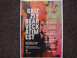
This poster is the most eye catching. They have star ratings and comments from magazines and music companies. Although the colours are very dull and ae not bright and eye catching, the bold lettering grabs the audiences attention, as well as this they have a banner of their album art work on their poster to give a more extra boost to their advertisment.
Again, this poster does not have eye grabbing colours or anything that will attract anybody to look at it, however the artist and its album are split up between each line, the ZLY is on the right hand side as the EST is the on left hand side, to show the balance.
This also has star rating from magazines and music companies. the bright and querky background makes the white font stand out and also shows the style of the band.


No comments:
Post a Comment